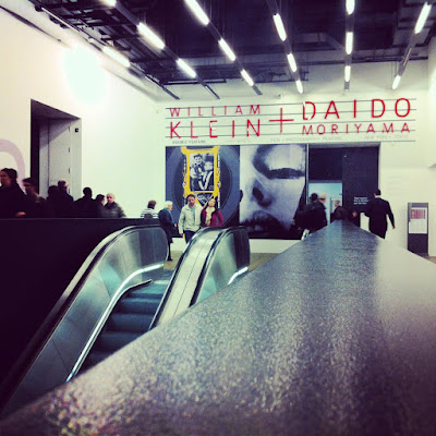
 This afternoon, thanks to a friend's generosity, I went to see the William Klein + Daido Moriyama exhibition currently being shown at Tate Modern. As the photographer I am striving to become, I found what I saw very thought provoking.
 I was totally ignorant of either artist before entering the rooms of the exhibition and I only recognised one image of all those that where on display, yet I didn't find myself in totally unfamiliar territory.
Perhaps due to the influence that those two photographers have had on our modern visual landscape, I found myself pointing out the Instagram-like qualities of several decade-old pictures. I was also pleasantly surprised to look at images, the sisters of which, by virtue of their subjects and compositions, adorn my flickr photostream.
I am currently at a point where, trying to take a more serious approach to photography, I am strongly questioning the quality of my output. A few of my pictures are reasonably good but I feel that the vast majority are mediocre at best. I am confident of my eye for composition but I feel let down by the technical side of things much too often.
I approached today's visit as a means to further my reflection on my own work by looking at that of recognised fellow practitioners of the art (however pompous that sounds).
It didn't really help.
It was amusing to see books on the rules of photography on sales at the end of the exhibition when it is evident that for Klein and Moriyama rules were made to be broken. I can't help but wonder however if they went too far in that direction.
For me, too many of the works on display were blurred, too grainy, and not particularly well composed. I can certainly admit to regularly deleting many of those shots from my own camera. Perhaps this is where I am going wrong!
 |
A random selection of Moriyama's 1972 work (Farewell Photography) only slightly made more unclear by my cameraphone.
|
This display of what seemed shoddy photographic work, nothing more than bad snapshots, felt at times like disrespect toward the viewer and toward other photographers who work hard to add technical quality to the artistic merit of their work.
Hanging next to those images were also beautifully composed, razor-sharp shots; testaments to the artists' technical abilities. This was particularly striking in Moriyama's 1980s close ups, towards the end of the exhibition.
That the artists released those images proves that they were happy with how they looked and what they expressed but I was led to question what makes a "good image"; the eternal "my five year old could do just as well" dilemma. If it is at all possible to define one, which yard-stick can we use to measure the quality of a photograph?
Has it to do with the technical qualities of the image; how sharp and well-lit it is? Has it to do solely with the subject? Has it to do with the artist's creative decision only ("this is a good picture" and so it is)? Is it a mixture of all this?
Or has it to do with the fame of artist? The cynic in me can't help but wonder how the public would consider the same shots if they weren't on display in one of the world's major art galleries, claimed by a recognised photographer.
The viewing figures of my more unorthodox output on flickr (which doesn't resemble what I say today), seem to indicate that such images generally elicit little interest.
Of course much of art's appreciation is highly subjective but it is one thing for an artist to decide that one particular piece is of value, and it is quite another to convince other people that this is the case and to build the type of consensus (however limited) enjoyed by renowned artists.
Most probably it is only a measure of my own limitations that I failed to see merit in so many images displayed in that show.
Unfortunately, there were no answers along with all those questions I stumbled upon today and I am possibly even more confused than I was before. I am going to have to carry on looking for them and hopefully have fun creating interesting images in the process...
Unfortunately, there were no answers along with all those questions I stumbled upon today and I am possibly even more confused than I was before. I am going to have to carry on looking for them and hopefully have fun creating interesting images in the process...
Your well-written post reflects my own feelings about the world of fine art photography.
ReplyDelete